Design Does your brand need responsive logos?
From Billboards to Smartphone Screens: The Whimsical World of Responsive Logos and Keeping Your Brand Cool on All Platforms
To truly grasp the significance of a brand logo, one must understand its immense power. When prompted to envision a company, most people immediately conjure up its logo. Take Adidas, for instance. Just the mention of the brand likely brings its iconic logo to mind. But what exactly do you see? Are you simply picturing the three stripes, or can you also visualize the Avant Garde Gothic Adidas font beneath?
A truly effective logo transcends its individual elements. It becomes a recognizable symbol that resonates with your customers, regardless of its presentation. This is where the concept of responsive logo design comes into play.
The idea of using simplified logos for different context predates the age of smartphones and responsive websites. Nike has frequently used the “Just Do It” tagline and swoosh interchangeably, without making their mark seem as though it’s missing something.
Now, these practices are becoming increasingly common as the age of technology forces more companies to think about how customers engage and interact with their brand.
As one of the most essential visual assets your brand has, your logo needs to continue making an impact whether people see it on a billboard, a computer screen, or a smartphone.
Responsive logos maintain your image across every channel, allowing your brand identity to scale and adapt wherever you encounter your audience.
This is your guide to responsive logo design.

What are responsive logos?
In 2022, the number of internet users grew to over 5.3 billion.
Of that number, 48.2% of all the people interacting online are using a smartphone, instead of a desktop device. This means that companies that don’t take mobile users into account are ignoring almost half of their consumer base.
Responsive logos are a crucial aspect of “responsive web design.” The idea behind responsive web design is that customers should have a consistent experience with a brand, regardless of whether they access the website from a desktop or a smartphone. Similar to a responsive website, a responsive logo can adapt to fit any screen size. Typically, more intricate and detailed designs are used for larger desktop screens, while simpler options are created for mobile users. This ensures a seamless and visually pleasing experience across devices.

Why are responsive logos important?
By implementing responsive logo design, you guarantee the preservation of your brand identity, regardless of the touchpoints where customers engage with your company. Responsive logos provide a means to uphold visual consistency across various environments. As we all recognize,consistency is a critical component in developing brand familiarity and customer loyalty.
While there’s no one-size-fits-all strategy to creating the ultimate responsive logo, most designs are defined by the following features:
– Dynamism:
Responsive logos need to adapt automatically to suit the screen they’re being viewed on. In today’s highly-digital environment, companies may need to create a broad range of designs reaching all the way from a complex “full” logo, to a very basic brand mark.
– Minimalism and simplicity:
Simplicity has long been a crucial component of effective logo design. Although it can be tempting to get carried away with complex designs when you’re creating your image for the first time, too many features in a single logo can make it harder for your audience to understand what you’re trying to convey with your mark. Responsive logo design embraces the “less is more” approach, as simpler designs can scale more easily across a range of platforms.
– Versatility:
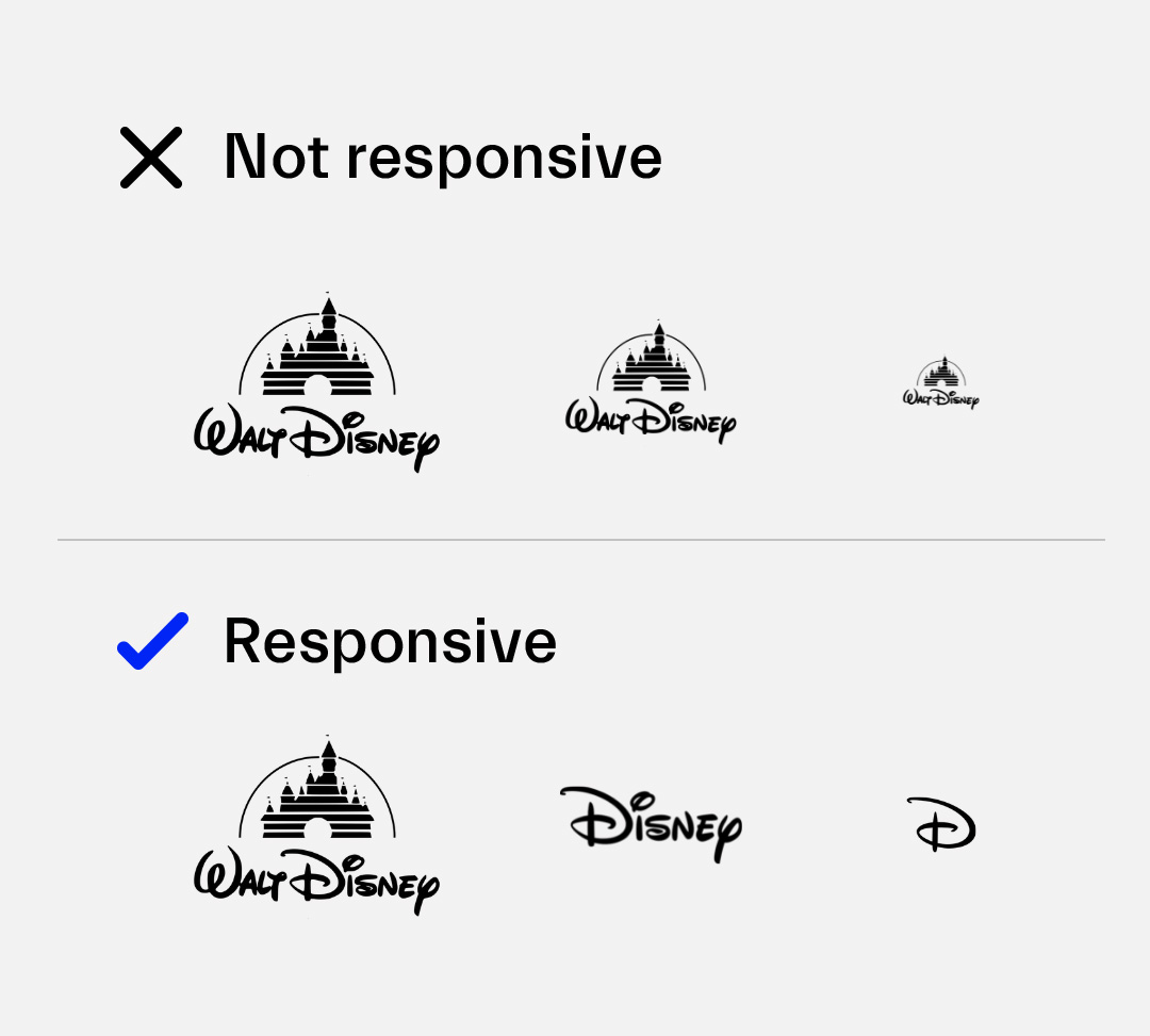
Excellent responsive logos need to maintain their legibility and impact with all screen sizes, even when you’re showing your customers your most basic design. For the smallest screens, designers have the challenge of creating a tiny icon that perfectly portrays the identity of a specific brand. Just look at Disney, for instance. Their most straightforward responsive logo design is a simple “D,” using the innovative typography of the Disney brand.
The Advantages of Responsive Logo Design
There’s much more to an effective brand than a fantastic logo design.
However, it’s safe to say that your logo is one of the most important assets you have when it comes to business recognition and identification.
Your logo is a simplified and visual demonstration of everything your business stands for. Often, it takes a lot of time and creativity to create a genuinely compelling logo. Once you’ve found something that connects with your target audience, the last thing you want is for that image to be ruined because it can’t load properly on a certain device.
Responsive logo design is a crucial way of making sure that your brand maintains its visual assets across every channel. What’s more, there’s power in simplified logos. After all, the human brain naturally recalls and retains simple information more easily than complex forms.
The demand for simplicity in logo design is why companies have been experimenting with what we now know to be “responsive logos” for a number of years. Just look at Apple’s first attempt at creating a logo all the way back in 1976. Although the image was beautiful and creative, it was far too complicated to survive, particularly in today’s digital environment.
By switching to something simpler, Apple was able to create an image that’s much easier for their customers to remember, and far more adaptable too.

The benefits of a responsive logo include:
– Freedom to explore every channel:
With a responsive logo, you don’t have to worry about how your promotional plans are going to show up on different devices like computers and smartphones. You have the freedom to engage with your customers wherever they are, without losing any integrity in your brand image.
– Future proofing:
The best logos need to be more than just attractive and descriptive. For a logo to truly succeed in any industry, it needs to stand the test of time. Responsive logos are built for the ever-changing digital interactions of the future. When you can refine your brand mark to something as simple as a shape or letter, you’ll always be prepared to reach your customers.
– Consistency:
As mentioned above, one of the biggest benefits of learning how to create responsive logos, is that you’ll be able to maintain your visual identity, wherever you go. Consistency is crucial to earning brand awareness and recognition. With a responsive logo, you can provide your customers with a cohesive experience, without compromising your visual appeal.
The important thing to remember is that responsive logo design isn’t about creating a number of different logos for every device your customer may use to interact with you. Responsive logos are simplified and enhanced versions of the same brand mark, conveying crucial elements of your visual identity in unique ways depending on the channel your user prefers. It’s about getting the full value out of every aspect of your logo design.
How to create responsive logos – 3 crucial rules
Now that you know the answer to “what are responsive logos,” and you understand what makes responsiveness important in the digital age, it’s time to start planning your logo designs.
As you may already know, there’s more to branding than visual design. A brand encompasses all of the defining aspects of your business, from the colours you use to make customers feel something about your organisation, to the messages you send in your marketing campaigns. Responsive logos can convey the “essence” of your brand, regardless of where your customers interact with your company. By harnessing technology solutions like “SVF” (scalable vector formats) responsive logo design companies can create logos that work seamlessly in any environment.
While learning how to create responsive logos isn’t something you can do overnight, there are 3 essential rules that you can keep in mind if you’re exploring the benefits of responsive logo design for yourself. These rules are:
1. Always design for simplicity
Non-responsive, or traditional logos can be complicated. Many include an image, specific typography, and even a strapline that appears underneath the logo on your website or business cards. However, when it comes to responsive logo design, the key to success is simplicity.
Often, designing for simplicity means carefully examining your brand mark and removing anything that’s not necessary. Determine which parts of your logo are most likely to capture customer attention and remind people of the unique elements of your brand. For instance, look at the Walt Disney Logo:
If you’re watching a Disney movie on your television screen, you can see the full, animated Disney logo, complete with Tinkerbell, sparkles, and the Magic Kingdom fairytale castle. However, on the Disney website, you get something much simpler – just the name “Disney” in the iconic brand font.
By choosing their unique typography as the most crucial element of their logo, Disney can scale their design up or down according to their needs. On smartphone apps and screens, just the “D” is enough to earn brand recognition.
2. Focus on adaptability
Along with being simple, yet compelling, responsive logos also need to be adaptable.
Any great logo designer knows how important it is to invest in versatile designs that stand the test of time. When it comes to figuring out how to create responsive logos, designers often focus on quality and legibility, and how the image will need to transform from one screen to another.
Responsive logos need to be versatile enough that they can be narrowed down to their bare essentials, without losing their connection to your brand identity. Look at Google’s logo for instance. The Google name mark is simple enough, to begin with, with a selection of primary colours and a friendly, modern font.
The font and the colours are the most memorable components of the Google logo, which means that even this simple brand mark can be refined even further. In some cases, the Google logo appears as a simple “G,” segmented into the different colours of the original logo. In other environments, the Google logo reduces to nothing more than a series of dots in blue, red, yellow and green.
No matter how basic the Google logo gets, it’s still effective at identifying the brand. That’s the mark of a truly adaptable logo.
3. Search for new ways to declutter
One of the biggest mistakes companies make in responsive logo design, is assuming that they need to keep too much of their original brand mark to ensure that they don’t miss out on awareness or recognition. Despite what you might believe, brand identity is rarely affected when small adjustments are made to your logo. The key to success is finding out which elements make your mark recognisable and using them in unique ways. For instance, you might:
- Remove images (like with the Disney castle).
- Eliminate unnecessary slogans and taglines.
- Remove lines and shapes.
- Get rid of unnecessary colours.
For example, when it appears in a smaller browser, the HubSpot logo removes every aspect of its word mark except for the distinctive “o.” Through a simple icon, HubSpot conveys its entire brand identity, without taking up unnecessary space.
Strategies for a sensational responsive logo
There are many ways that companies can invest in successful logo design.
For the most part, the aim of the process is to remove any intricate details that wouldn’t show up as well on smaller devices, leaving behind the style of the brand that your customers have come to know and love. If your customer can’t recognise your company instantly based on a responsive logo, then you’ll need to go back to the drawing board.
Some of the best options available for designing your responsive logos include:
1. Creating logo variants
If there are many different aspects of your logo that can capture your audience’s attention, then you can create various brand marks using different elements of your design. For instance, as we mentioned above, Nike uses everything from the “Nike” typography to the Swoosh shape and the “Just Do It” tagline to connect with their audience.
2. Reducing logo elements
If your logo is too complicated to break down into different variations, you can try a simplified variation instead. For instance, the Mastercard logo removes everything from drop shadows to colour gradients to deliver a more simplified mark on responsive designs. All the company needs is the two interlocking circles to demonstrate its identity.
3. Getting rid of text
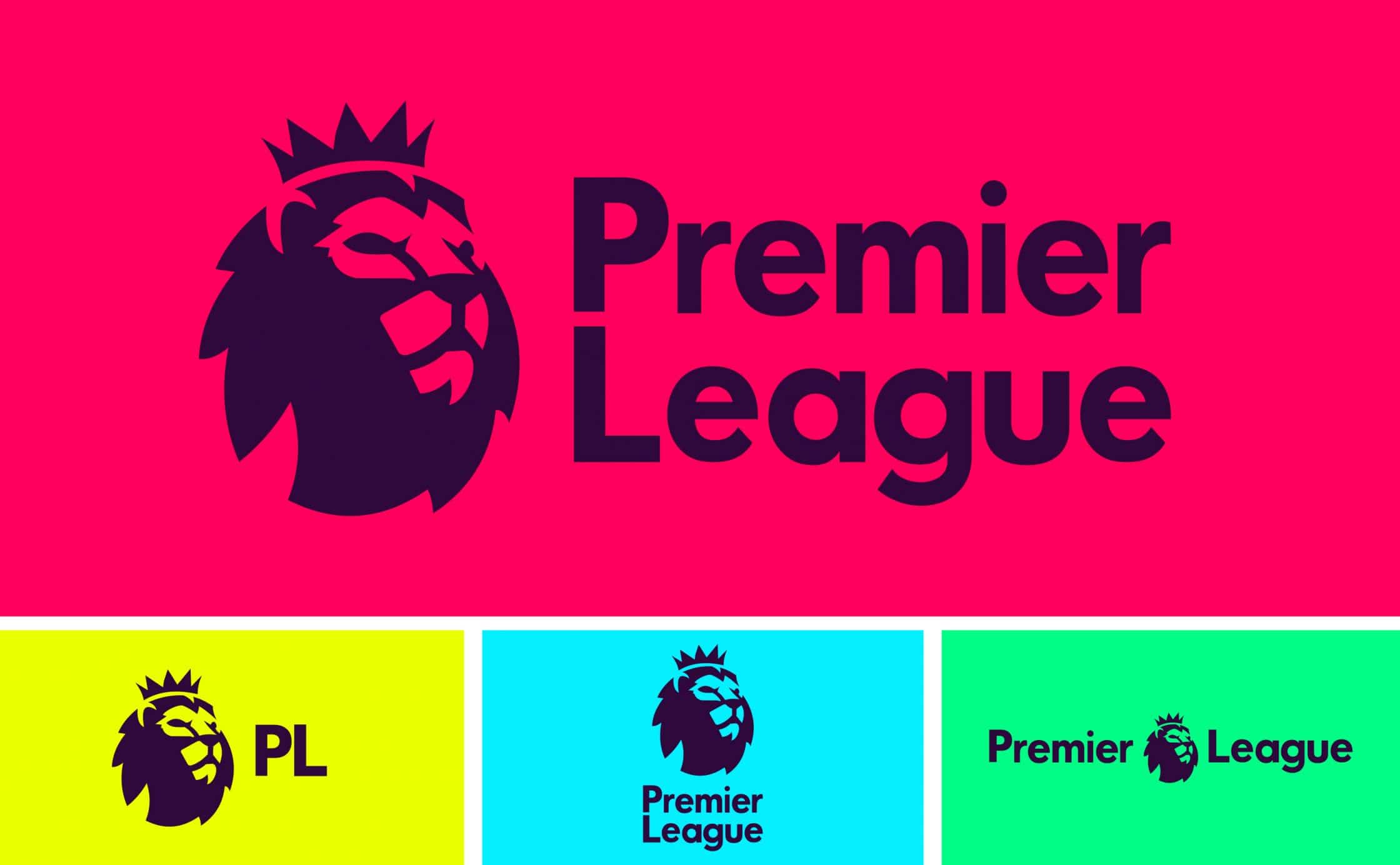
Removing text from a logo is one of the simplest ways to create a responsive logo design. Sometimes, the image in your brand mark is more recognisable than your chosen font or strapline. This is undoubtedly the case with the Premier League lion. By removing the “Premier League” typography, the company instantly simplifies its logo into a single, responsive icon. The icon is even distinct enough that the Premier League brand could remove or change the colour and still have the same impact on their audience.
4. Designing flat logo variants
Sometimes, your responsive logo will need to appear in its most basic form. If your customers are viewing your brand mark on a screen that can’t convey texture, colour gradients and other unique design factors, then the heart of your brand should still come through in the icon you offer. For instance, look at the Instagram standard logo compared to its flat logo variant. While the standard logo is a lot more compelling, the flat image is still instantly recognisable.
5. Vertical stacking
Finally, if there are various important elements in your logo that you want to maintain on any channel, then you may need to consider “vertically stacking” those characteristics. Vertical stacking is a common strategy in graphic design when creative experts want to place more content into a smaller square of space. Rather than spreading a logo out across a horizontal space, the idea is to pull everything together into an imagined box. For instance, look at the difference between the traditional “E-commerce Excellence” logo, and the responsive logo version:
The movers and shakers – Examples of responsive logos
According to economist Klaus Schwab, we’re in the midst of the fourth industrial revolution.
This age of digital transformation means that more companies of all shapes and sizes are going to need to learn how to create responsive logos in the years to come. Some experts believe that the majority of the browsing your customers do will happen on a smartphone in the future. That means that your responsive logos may become more recognisable than your standard brand marks.
Often, the best way to learn about something like responsive logos is to see them in action. That’s why designer Joe Harrison created an entire website called the “Responsive Logos Project” where you can go and play around with the marks of companies like Nike, Coca-Cola, and Chanel. This website offers a fantastic insight into how logos can be effectively reproduced and adapted for the responsive web.
To help you get a better idea of the impact that responsive logo design can have on your company’s image, let’s look at some of the best responsive logo examples in closer detail.
1. Bang and Olufsen
One of the best-known Danish brands in the world, Bang and Olufsen is a company dedicated to high-quality technology and manufacturing. B&O is also a great example of a company that thrives in responsive logo design. In the typical Bang & Olufsen logo, you get the name of the company and the brand mark in one long image. As you reduce the size of your screen, however, the logo becomes more vertically aligned, then removes unnecessary features like the brand name altogether.
2. Kodak
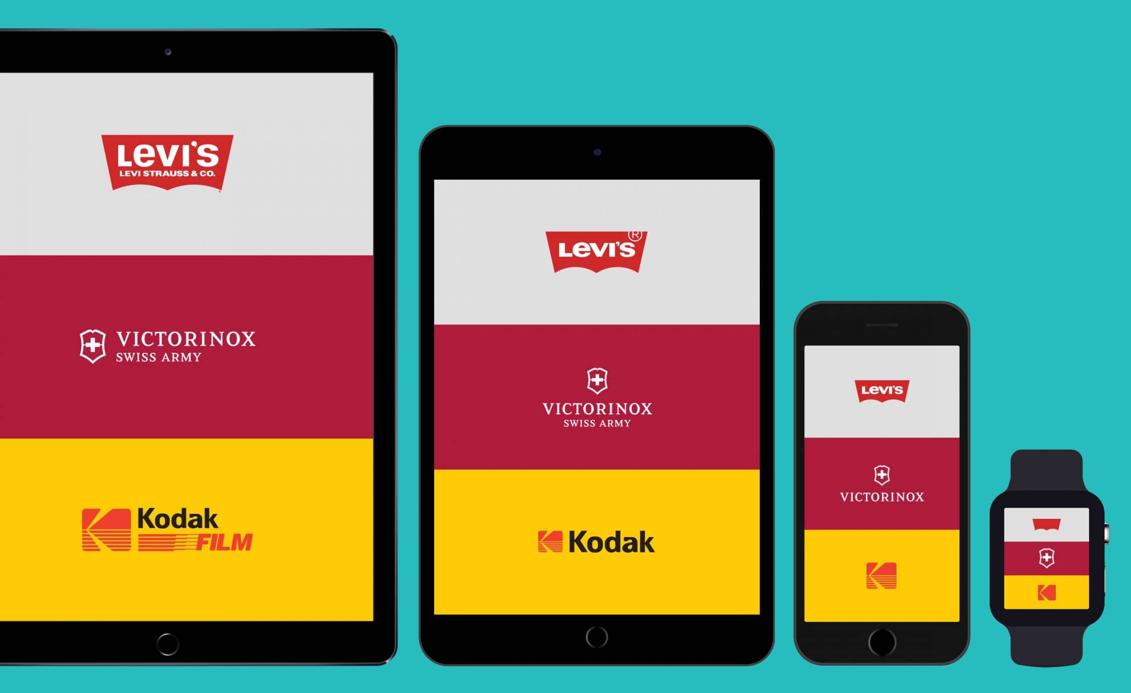
Kodak is another excellent example of a company that knows how to alter their logo to make it responsive. The most complex version of the Kodak logo includes the words “Kodak Film,” and a distinct image that conveys both a camera shape and an iconic “K.” As you move from a larger screen to a smaller device, various aspects of the Kodak logo begin to disappear, starting with the “Film” part of Kodak Film, then the “Kodak,” then the smaller details in the “K” brand mark.
3. Heineken
The best-known Heineken logo is a relatively complicated brand mark. Alongside some intricate patterns, the image includes an attractive scroll with the “Heineken” name written across the top in a distinctive font. There’s also the well-known Heineken star, and the words “Trade Mark” on either side of that star. To create a responsive logo, Heineken had to remove various elements from its image, starting with the trademark text and patterns, then the scroll, and even the “Heineken” wordmark.
In each of these responsive logos, the image goes through a series of stages for simplification, creating a new model every time your user’s browser window reduces. For every reduction in screen capacity, today’s responsive logo must become a little more refined, and a bit less complicated.
Are you ready to make your mark with responsive logos?
As we continue to embrace the opportunities of the digital world, it’s safe to say that logos will become simpler. Sometimes, less really is more in logo design, and a simplified configuration can often stand the test of time much better than a complex image.
With responsive logo design, companies not only improve the experiences that their customers have with their company – they also make sure that they have plenty of fantastic and visually-engaging ways to connect with their target audience.
Responsive logos allow companies to hold onto their brand recognition and familiarity across multiple channels and resolutions. In the years to come, this versatility will become increasingly important for businesses of all shapes and sizes.


